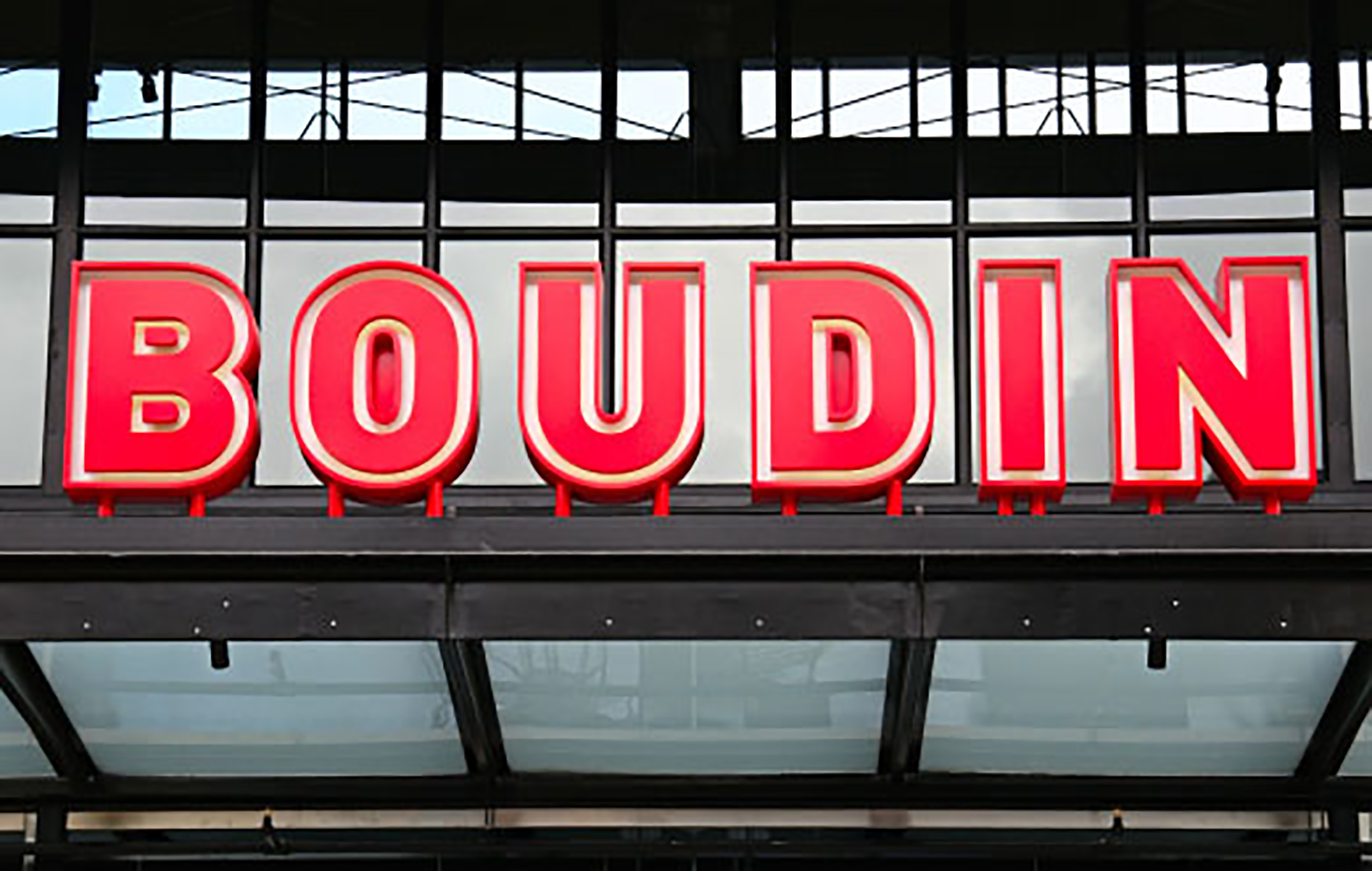
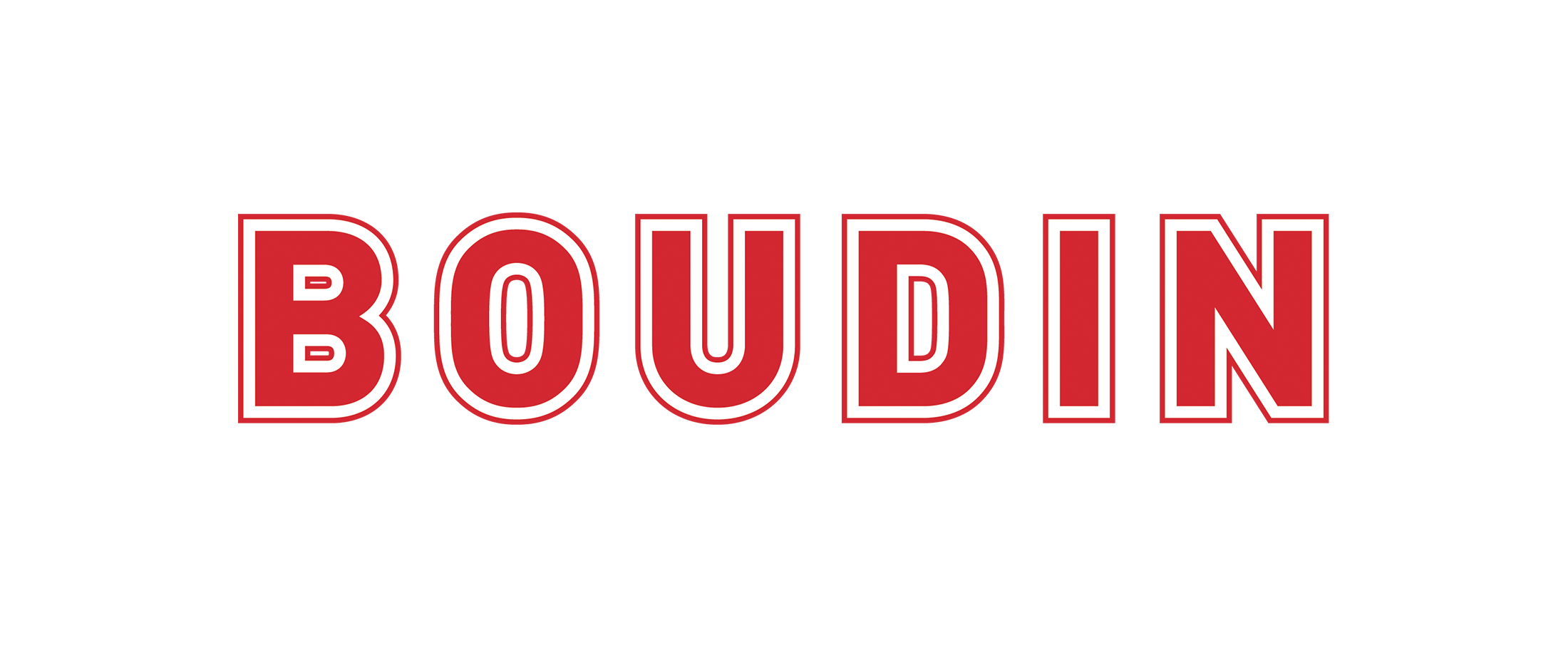
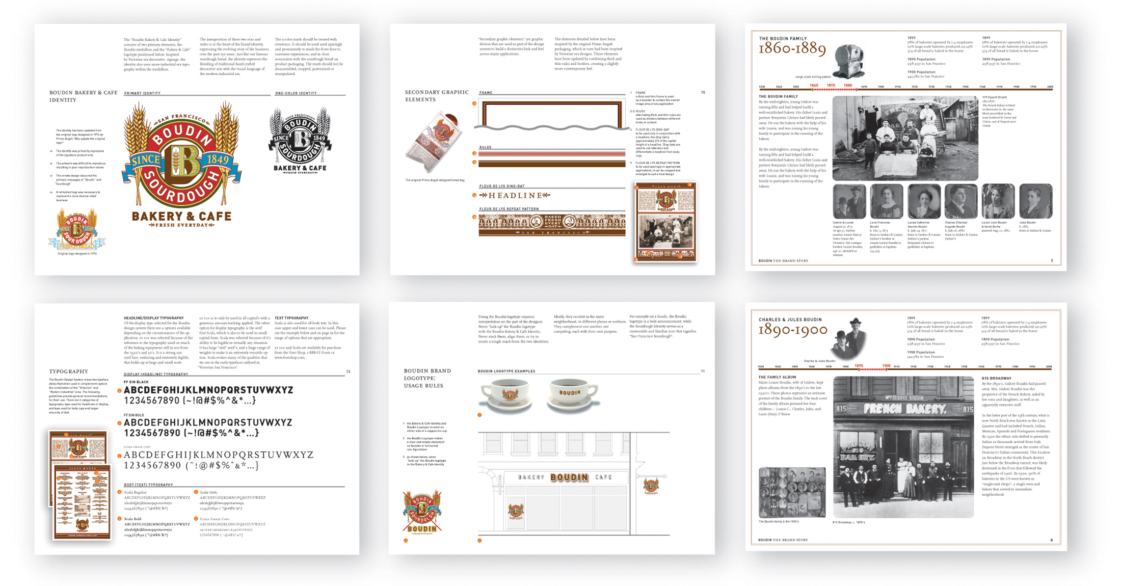
Established in 1849, Boudin had its roots in Victorian San Francisco, yet grew up in the 1920’s as new forms of mechanization changed the industry. A+A used this modern industrial era as inspiration for updating the brand. The single word of Boudin was extracted from the intricate sourdough logo to more boldly highlight the brand name on signage and packaging.
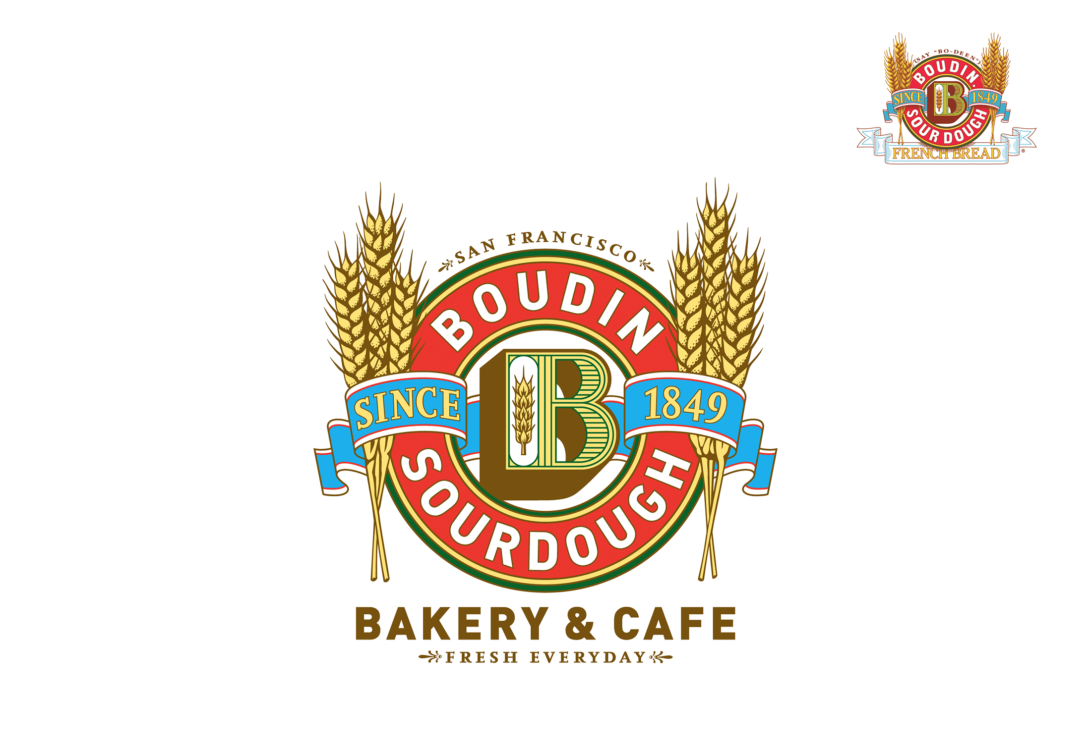
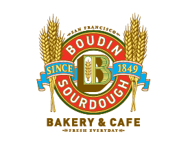
The iconic Boudin sourdough logo was designed in 1974 by Primo Angelli as a product brand for the emerging sourdough bakery. This original sourdough identity was modified by A+A to work harder for the growing retail brand, adding “Bakery & Cafe” while removing the “French Bread” scroll. The forms were streamlined to reflect the early 20th C. Age of Mechanization.
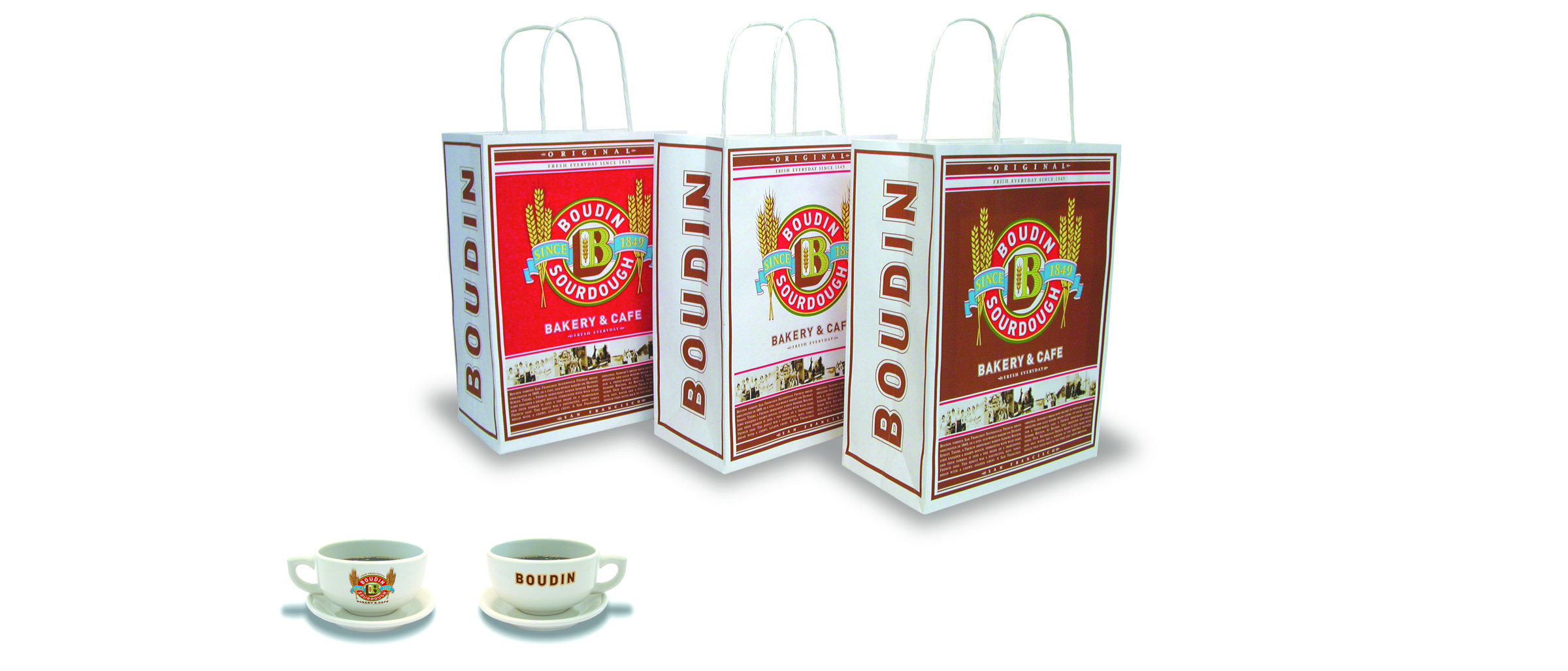
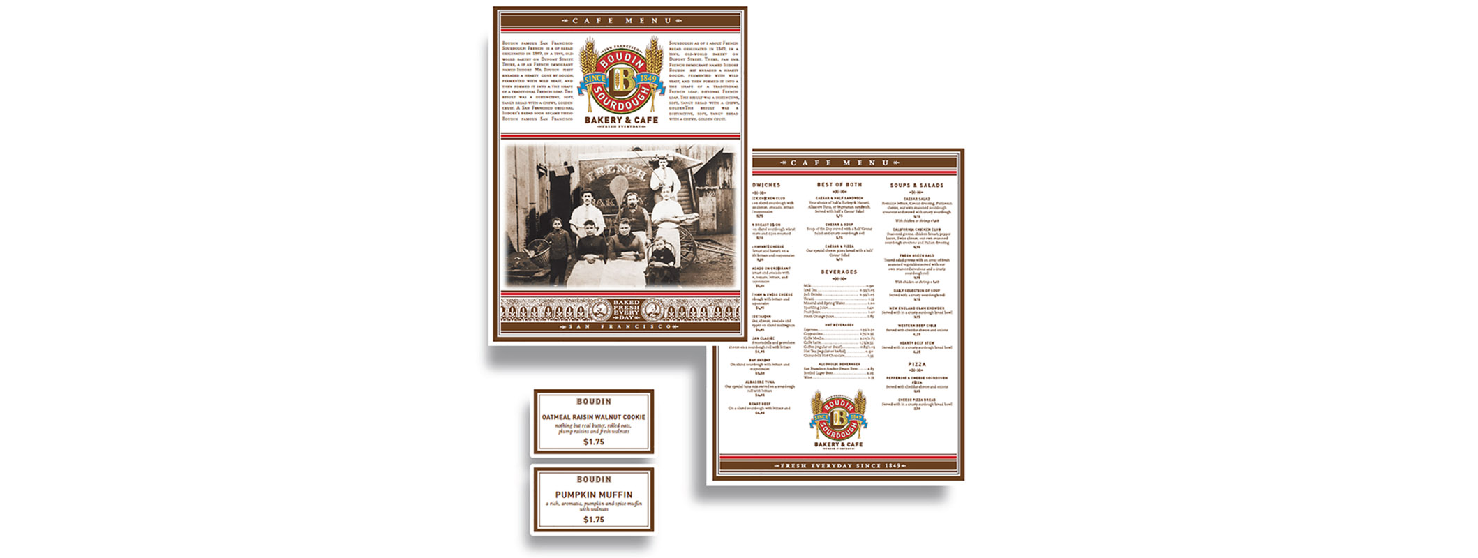
A new look and feel was extended across packaging, menus, marketing communications and crockery.
Brand design guidelines were created for use of the identity, colors, design elements and signage. The guidelines incorporated the Boudin history as a storybook for use in briefing, training and public relations.
The new brand identities, look and feel and brand story were used as the foundation of a major revitalization of the Boudin Bakery & Cafe business. Learn more about the San Francisco brand flagship experience, also conceived and designed by A+A — Boudin at the Wharf.